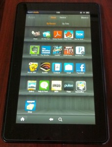
 Got my K-Fire today! Yes that’s what all the cool kids will be calling the Kindle Fire after today. ;)
So far I have to agree with the need for a bit more polish on the software side. A few quick things I’ve noticed so far:
- WiFi connection seems to come a go a bit (tho part of that is my flaky Samsung 4G hotspot).
- Speaking of 4G the Silk browser does seem to speed things up noticeably over this non-cable speed connection.
- The auto-brightness is maddening. Sitting at my desk and holding it steady it kept changing up and down. Thankfully you can turn the auto off.
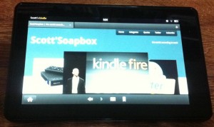
- The web browser setup wastes valuable screen space. I’d rather the menu bar at the bottom was somehow integrated into the top. Or give me the option to turn off the top bar… 7″ is nice compared to my iPhone but it doesn’t include extra space.
- The same goes for the home button in general… I think it would have made more sense to stick it next to the YourName’s Kindle. First it’s always there so less tapping the screen to bring up the hidden home button. Second it seems like most of the navigation on the fire is a top menu bar – so why keep the default android home position on the bottom?
Of course these can all be fixed with a software update that I’m sure is in the works. So Fire is good now and here’s hoping it hits great by Christmas.
Note: Sorry about the crappy images – I haven’t figured out how to screen capture on this thing yet…
